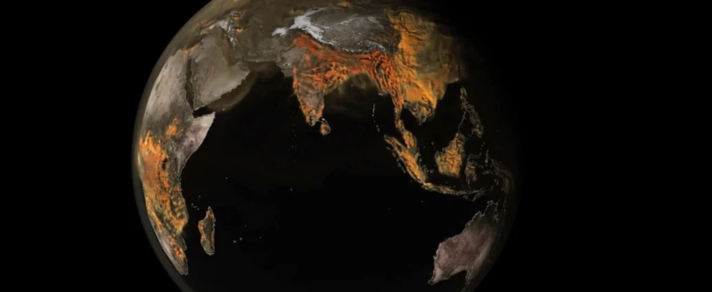
NASA has released a new visualization, showcasing carbon dioxide’s (CO2) journey across the globe. The visualization highlights the gas’s movement, influenced by wind and atmospheric patterns. The US emerges as a significant contributor to emissions. In 2021, it accounted for over 12% of global emissions, trailing only China.

NASA’s detailed visualization allows viewers to zoom in on emissions sources. Power plants, fires, and cities release carbon dioxide, which then disperses across continents and oceans. Scientists aim to use this data to understand how emission sources interact.
Human activities, including industrial processes, transportation, and deforestation, drive CO2 emissions. The US and China bear the brunt of responsibility. Conversely, Africa and South America face challenges from land management fires.

The visualization captures the dynamic nature of emissions. Fires ignite and subside, impacting CO2 levels. Plant life also plays a role, absorbing and releasing the gas.
NASA created this visualization using a powerful supercomputer model, Goddard Earth Observing System (GEOS) . Its exceptional resolution exceeds typical weather models by over 100 times. This tool offers unprecedented insights into carbon dioxide’s behavior.
The visualization serves as a stark reminder of human impact on the planet. It underscores the urgent need to reduce emissions and transition to cleaner energy sources.
Reference- NASA Video, Futurism, National Geographic, BBC, The Guardian


